My two cents for the Garden Bloggers’ Design Workshop
 I’m not physically colorblind. But I don’t fret much about color because Sydney Eddison told me not to.
Just as my gardening obsession was approaching full bud, I had the pleasure of picking up Sydney at the airport and spending several hours chauffeuring her around a conference here at Cornell where she was speaking. (A nicer person you’ll never meet. I still cherish the bucket she gave me. Nice interview with her in the latest Fine Gardening, btw.)
I didn’t know a lot about garden design at the time. But I did know that if anyone could help me unlock the key to color in the garden, it was her. I was starting to research and write a web feature on color in the garden, and knew the basics about the color theory. But she regaled me stories of matching blooms to color combinations in her favorite art works and painting her patio furniture to complement the color schemes in her container plantings. I was fascinated, but admitted that I was overwhelmed by the possibilities.
She told me that I didn’t have to start with anything terribly sophisticated. I could simply start by planting something with light foliage next to something dark. That made me feel good, because at the time that was about the only intentional color management I had already done in the garden.
 Writing that web feature about color in the garden helped me to intellectuallize color theory. And it really clicked when I started doing more web work and had to pick colors for websites and other electronic communications. In fact, the principles of gardening and web design have a lot of overlap, and a lot of it isn’t rocket science. (If you want to draw the eye to something, nothing works like red.)
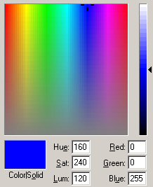
Play around with that little color-chooser that’s associated with most all Microsoft software (right) or the more sophisticated ones in Photoshop and other imaging programs, and you’ll know as much about color as you’ll get from a pile of paint chips or the RHS color codes.
But have I applied all this color theory to plant selection and combination in my own garden? Not so much. I try to match plants to the conditions and usually use the pot and shovel school of design: I wander around with a plant in a pot in one hand and a shovel in the other until I find someplace I can squeeze it in with a reasonable chance of surviving. Can’t say as I think much about the color of the neighboring plants or whether or not they’ll be blooming at the same time or whether or not those blooms will clash or blend.
I partly blame Piet Oudolf for my lackadaisical approach to color. In one of his books, he points out that by massing plants in large drifts and choosing plants where the ratio of flower to foliage is relatively low, your chances of accidently hitting on a dreadful color combination is minimized. That works for me.
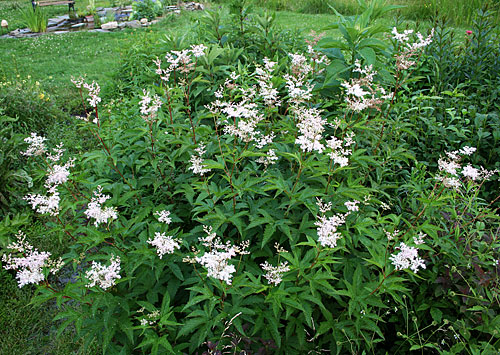
Filipendula has a reasonable flower-to-foliage ratio.
So don’t get me wrong, I love color. And like Justice Potter Stewart said of pornography, I may not be able define great color in the garden, but I know it (and appreciate it) when I see it. I just let the plants surprise me through the season, rather than sweating up front whether or not the colors will work together.
All that said, I went through some images to see if they could provide me with some introspective clues about how I really feel about color in the garden.
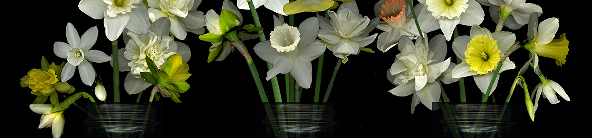
I find I like interesting color combinations within individual flowers probably more than I like color combinations of groups of plants I may have put together:

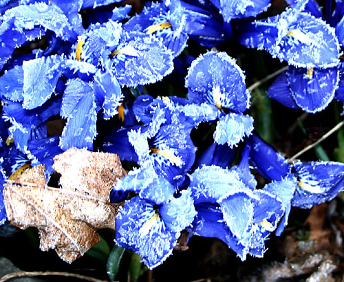
Iris histrioides ‘Katharine Hodgkin’
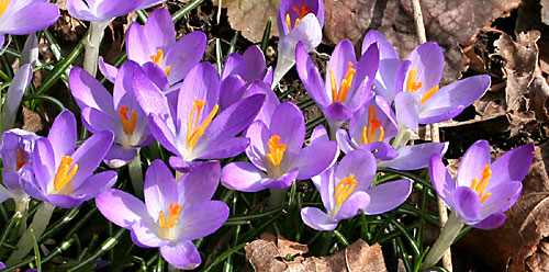
Crocus
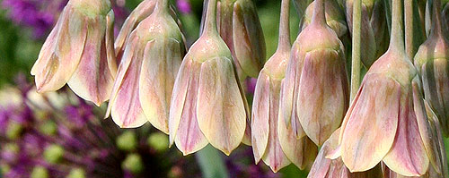
Nectoscordum
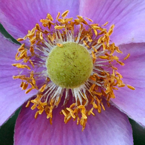
PhotoShopped anemone
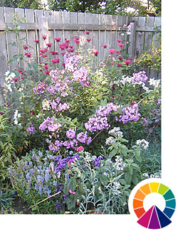
I’m a sucker for the cool end of the spectrum — the purples and blues. It’s probably why I also have so many blue pots and explains the cobalt-blue bottle tree and other decorations.
Iris reticulata
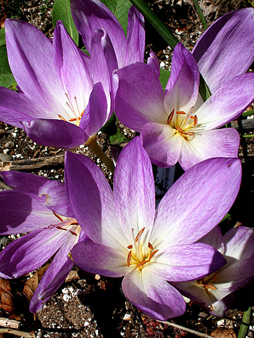
Colchicums from Kathy
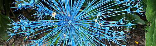
Spray-painted allium seedheads
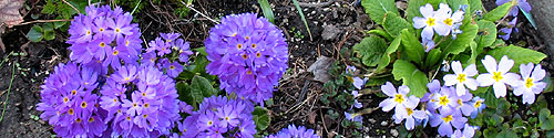
Purple primulas
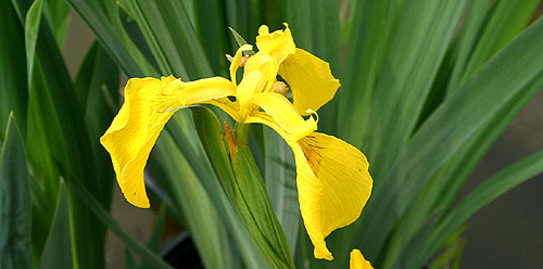
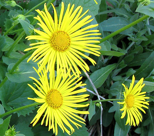
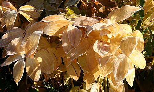
I have a ‘surfeit of yellow’ most of the time.
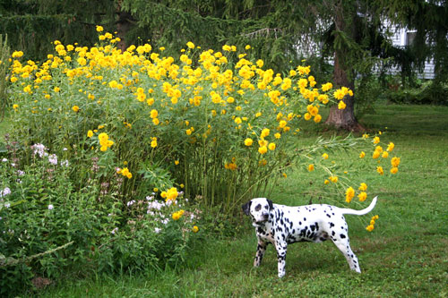
Fred and outhouse plant.
Orange was my favorite color as a kid. Now I like to see orange only sparingly in the garden. Same with red.
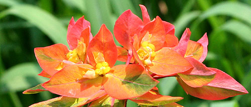
Euphorbia griffithii ‘Fireglow’.
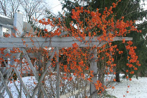
Bittersweet
Brown is a color, too. Often it means the plants are dead. But live or dead, I like it.
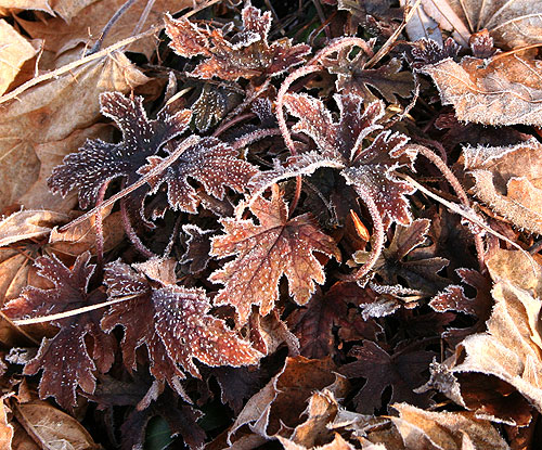
I think the color of variegated solomon’s seal peaks just before it dies:
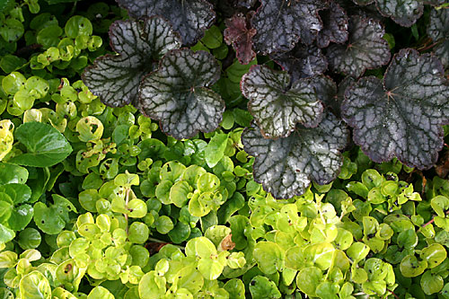
Echoing colors works in the garden, even on the micro level. So if you have a plant that’s happy where you are, spread it around.
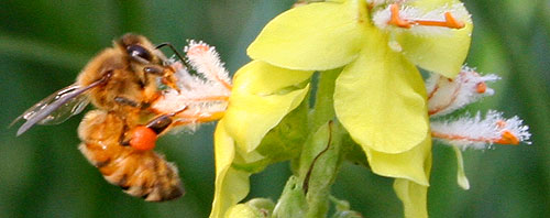
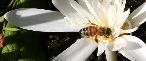
Bee on verbascum
Verbascums
Unlike Nan Ondra, I like white — clean, dirty or anywhere in between.
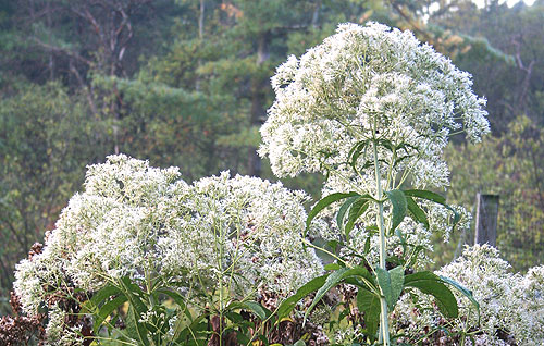
Eupatorium purpureum ‘Joe White’
Colchicum autumnale ‘Alboplenum’
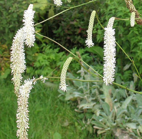
Sanguisorba tenuifolia
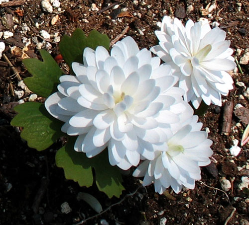
Sanguinaria canadensis ssp flore plena
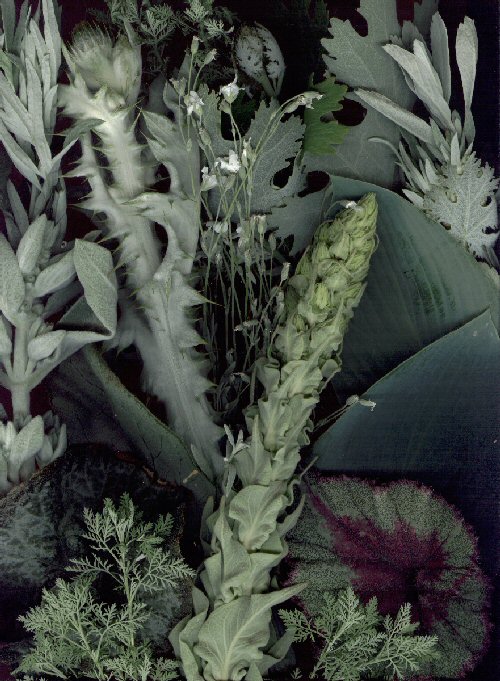
Grays are great. If I was gardening in a closer space and more adventurous with color, I’d use them more as separators.
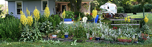
One of my June bloom day scans.
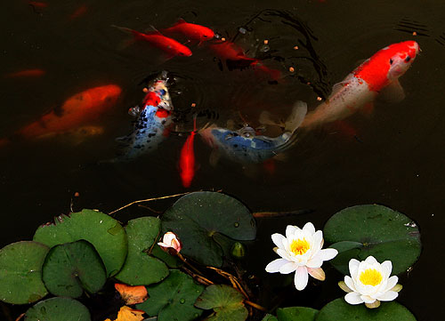
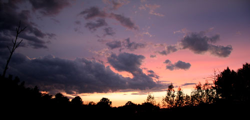
I’ve given up trying to compete with fish and sunsets.

I love your version of the Stewart quote, Craig. Or in other words, “I don’t know much about color, but I know what I like.” Works for me! You presented a glorious rainbow of images. After the Photo-shopped anemone, I had trouble working out that the following image (the frosted irises) was actually real. I do like the white in your garden, but I think my favorite image was the Allium sherwin-williamsii var. azureum.
Craig;
Color in the garden is over rated(design -wise) . . . why?
Color is fleeting.
But foliage last all season.
Foliage is the key, the forms, and the textures, the highs and the lows . . . how the mass plays off the voids.
Color comes and color goes, it’s nice to have. to enjoy that week or two, or three of a big splash.
having said all that-great post. Great display of colors.
Nan: While doing chores today, I realized that the analogy with Stewart is somewhat flawed. Often, I do know why I like a combination, and can sketch it out on the color wheel. I just don’t plan for it. I analyze it after the fact.
Good points, Rick. Form and texture is a little easier for me to visualize, but I’m still somewhat hit and miss.
What a great post. And brown is the new black.
I’m with Rick on making sure the foliage works. Flowers don’t last long enough.
That being said, I gotta’ get me some Nectoscordum, I love the color. And “forced-color” allium seedheads is great! I’m definitely going to do that!
Jim: From a distance, Nectoscordumaren’t all that impressive. But when you move in close, you gotta love them.
The garden photography is impressive and inspiring.
Heh…I can relate to “unintentional planning” and simply enjoying the ends without sweating the means. Even when I try to plan for a specific “look”, I’m usually left to enjoy a happy accident of decent results based on nothing I actually did.
ВеÑёлые поÑÑ‚Ñ‹ у Ð²Ð°Ñ Ð²Ñ‹Ñ…Ð¾Ð´ÑÑ‚, но они выходÑÑ‚ очень не чаÑто 😉